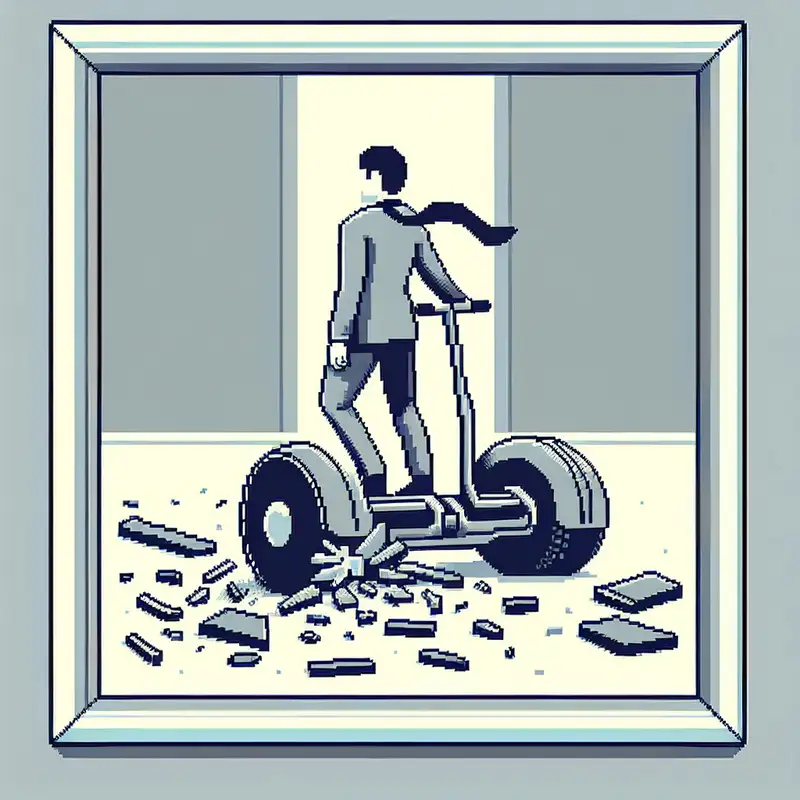
"This article written by Paul Graham in 2009 examines the reasons why Segway could not fulfill its initial promises. He points out that someone using a Segway looks 'stupid' and gives off a 'smug' impression. Graham suggests that because we look like we're just standing on a Segway, it carries us effortlessly, and this situation creates discomfort in people. He argues that Segway's failure actually stems from the company itself being a kind of Segway: Because they were very successful in raising money, they quickly moved forward without understanding that people looked stupid while riding them, instead of slowly improving their products based on user feedback.
---
# The Trouble with the Segway (The Real Reasons Behind Segway's Failure)
July 2009
The Segway hasn't delivered on its initial promise, to put it mildly. There are several reasons why, but one is that people don't want to be seen riding them. Someone riding a Segway looks like a dork.
My friend Trevor Blackwell built [his own Segway](http://tlb.org/#scooter), which we called the Segwell. He also built a one-wheeled version, [the Eunicycle](http://tlb.org/#eunicycle), which looks exactly like a regular unicycle till you realize the rider isn't pedaling. He has ridden them both to downtown Mountain View to get coffee. When he rides the Eunicycle, people smile at him. But when he rides the Segwell, they shout abuse from their cars: ""Too lazy to walk, ya fuckin homo?""
Why do Segways provoke this reaction? The reason you look like a dork riding a Segway is that you look _smug_. You don't seem to be working hard enough.
Someone riding a motorcycle isn't working any harder. But because he's sitting astride it, he seems to be making an effort. When you're riding a Segway you're just standing there. And someone who's being whisked along while seeming to do no work — someone in a sedan chair, for example — can't help but look smug.
Try this thought experiment and it becomes clear: imagine something that worked like the Segway, but that you rode with one foot in front of the other, like a skateboard. That wouldn't seem nearly as uncool.
So there may be a way to capture more of the market Segway hoped to reach: make a version that doesn't look so easy for the rider. It would also be helpful if the styling was in the tradition of skateboards or bicycles rather than medical devices.
Curiously enough, what got Segway into this problem was that the company was itself a kind of Segway. It was too easy for them; they were too successful raising money. If they'd had to grow the company gradually, by iterating through several versions they sold to real users, they'd have learned pretty quickly that people looked stupid riding them. Instead they had enough to work in secret. They had focus groups aplenty, I'm sure, but they didn't have the people yelling insults out of cars. So they never realized they were zooming confidently down a blind alley.
---
Relevant Keywords: Segway problems, Segway public perception, Segway design flaws, Segway market failure, Segway user experience, Trevor Blackwell Segway, Eunicycle, public reaction to Segway, Segway vs skateboard, Segway development criticism, Segway investment issues."
 Episode 171